First of all;
Happy New Year! 🎉 🥳🥳
Happy new year to every reader of this site.
This might be an update post but might also be the only post I could wish y'all on.
🤔This is my first post for the year. 🤷🏾♂️
I hope you had a wonderful New Year celebration and are excited for the year ahead!
✍🏾I'm not a good wisher but I'm wishing a happy new year.
Today's post is just to log the changes made on the website. 😏 Yes this is still the same site; the homepage only changed a bit.
Changes Made
I have revamped the homepage hero and link boxes. Here’s a look at the changes:
Homepage Hero Section
Before:
 |
| How the homepage used to look with the logo as background |
I had to give up on this design because of the fact that it covers the whole viewport and added a big load to my LCP (Largest Contentful Paint ).
Also, there is usually and empty space when the homepage loads, before the browser download and display the image. The transitioning for an empty space till when the image fully loads also some weight to the CLS (Cumulative Layout Shift ).
Now:
 |
| The new homepage with Animated switching texts and two Action buttons |
I Got the same problem I ran away from in this new design.
Weight on LCP is only reduced by a little bit because of the long text with is rendered large.
The CLS also had a little improvement in results and was drawn back by the animated text. The text is a css trick to look like it's typing and backspacing itself. All these movements causes shifts and therefore added to CLS score.
On the LCP issue, I plan to fix this by adding a read more link later on.
I plan to make the read more link built with CSS only - I don't want an above the fold section depending on JavaScript. Hopefully this work out and helps 👌🏾
The CLS score is still manageable. I'll leave that for now.
Homepage Link Box
The link box appears below/after the hero section.
Before:
 |
| The Old Link Box Look - Even on Desktop View |
This old design is link box is designed to always keep links stacked on top each other, and they consumed a lot of space (😏 in my own view)
Now:
 |
| The New Grid Link Box adds to a compact view |
The new link box Is more finer than the old one. Not only that, it has a compact grid look on desktop and stack on each other on mobile.
 |
| The mobile view of the grid box: turns to a stacked list box |
About / Info Section
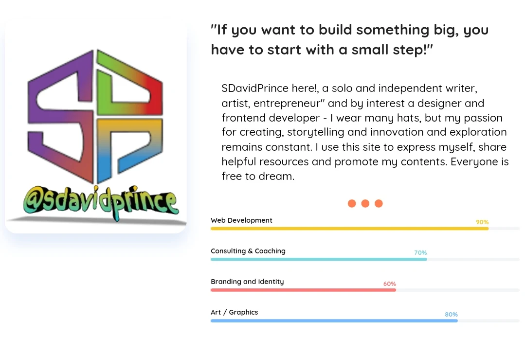
I also changed the Info / about section on the homepage and added skill bars to it.
Before
After
In the redesign, the Photo will only be visible on desktop, I added a paragraph slider made with css only. And below is my skills bar.
Other Sections Swallowed into an Offering Section
 |
| The old sections consumes space: |
The Portfolio / Creations section and other sections have been grouped into a new three(3) tabbed offerings section.
The offering section showcase what I do (my creations), my services and other exploration ventures making it easier for you to explore everything I have to offer.
 |
| The New Offering Section - no need to scroll |
Services: Find all the services I provide in one convenient place.
My Creations: Explore my latest projects and creations.
Venture Tab: Discover other brands and activities I am involved in.
 |
| On Mobile View |
The tab switch was rebuilt in pure CSS so it's always available for clicking. And it's very responsive and compact.
That's all
These updates mean no more unnecessary viewport space is consumed, making it easier for you to navigate and find what you need.
I hope you enjoy these changes and find them beautiful. Once again, I wish you a very Happy New Year filled with joy, success, and new resolutions!
Happy New year 🎊🎉


